Whiteboard Step: Setting Design Goals for Siege
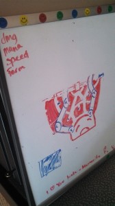
The original vision of Siege was to create a game mode that offered shorter matches and less complexity than Conquest. As with the majority of my levels, I started my design process on my whiteboard and outlined features that were desired:
- matches should, on average, be 25-35 minutes
- have less complexity than the Conquest map (no Fire Giant and Gold Fury camps)
- have a smaller map than Conquest, measuring from base to base
- have only 2 lanes
- use Mesoamerican/Maya art set
Having such goals and features be listed out helps me keep a focus when working out map ideas. Frequently, I’ll sketch layout plans down on the white board in the form of simple flow maps, paying more attention to things like camp placement and lane structure. During this stage, there’s less focus on rendering to-scale map overheads, and more about figuring out how players should navigate the map, and how jungle lanes should flow around and to objectives. Working on a whiteboard lets this part of the process be highly iterative and exploratory without committing immediately to a first-idea map.
Engine Blockouts
To make sure that distances between bases and objectives were appropriately scaled, I grabbed the static mesh platforms used as decoration under player starts to mark where players, towers, titans, and phoenixes all spawned in the Conquest map. Then, in a new map, I copied these meshes over and began manipulating the distances between player starts (representing the furthest point on the x-axis where players would spawn), phoenix spawns (representing the general exterior boundary of bases), and tower positions (which influence lane length and shape).
A terrain with 2 textures let me sketch out my lane ideas developed during the whiteboard process, and helped me to better visualize distances between points and some first-glance problems in creating breaks in line-of-sight. Once I felt I had a good layout done, I started the greybox portion of the design. This involved less actual grey boxes, and more generic meshes- wall pieces and rocks were placed to provide rough estimations on what wasn’t playable space. Place-holder trees, with a material that shifted color from green to orange depending on the tree’s location on the x-axis, helped players orient themselves in the world. These simple assets let us quickly test out the first few rough map iterations, and make needed changes to help with flow and clarity.
Iterating on Design
Despite my making sure this new map was roughly 60% the size of the Conquest map, it was clear early on that the map still felt too large, and so I went through a few more tweaks to shorten the distances between bases. I had also added in side jungles at the start in a tribute to Smite’s original Conquest map, but after several playtests and revisions of that space, it was clear that they did little more than spread out players and offer more, unnecessary complexity to the map. Our goal was to focus and encourage team fights, not discourage them by having too many places to hide in.
I had also tried out an idea that would have different lane designs. This idea was good in theory, and was meant to help players call out where they’d play at the start of the match. However, as the map size decreased, we ran into issues: if we made the lane curve out, travelling to the enemy base took forever. Having that lane be straight offered too much sight down the lane. Eventually, we settled on the idea of just having the lanes be mirrored.
Figuring out jungle camp places was another challenge. Initially, there were XP farms sprinkled in the exterior jungles, and then moved to the interior jungle. However, combined with having locations for more important camps- such as damage and speed- there was just too much going on in the jungle. Having so many objectives meant jungle paths were weaving practically everywhere. Trying to block line of sight within the already small space made the jungle feel claustrophobic and confusing. Normally, that might be desired in a representation of a jungle, but with the number of AOE abilities in the game, these attributes were frustrating. The simple XP camps were eventually ripped out of the map entirely. We suddenly had a “cleaner” jungle, and were able to shorten the length of the map even more.
Capture Point and Escort Mechanics
The importance of the center of the map changed pretty rapidly. At first it was just a decorative space, but only a few playtests into developing the mode, it was suggested that an objective be placed there to encourage team fights. The objective became something that spawned a lane pusher- a mechanic introduced in the Arena mode to help matches end quickly.
Several changes were made around developing this mechanic. At first, the capture point used the Gold Fury- reskinned to be a Silver Fury- to show the importance of the objective. The space she spawned in went through a lot of changes to make it more open, to allow for ways to sneak around and steal the objective from enemies, to allow quick access to the lanes. More changes were done to determining when the Silver Fury spawned, in which lane the lane-pushers spawned, when lane-pushers spawned…
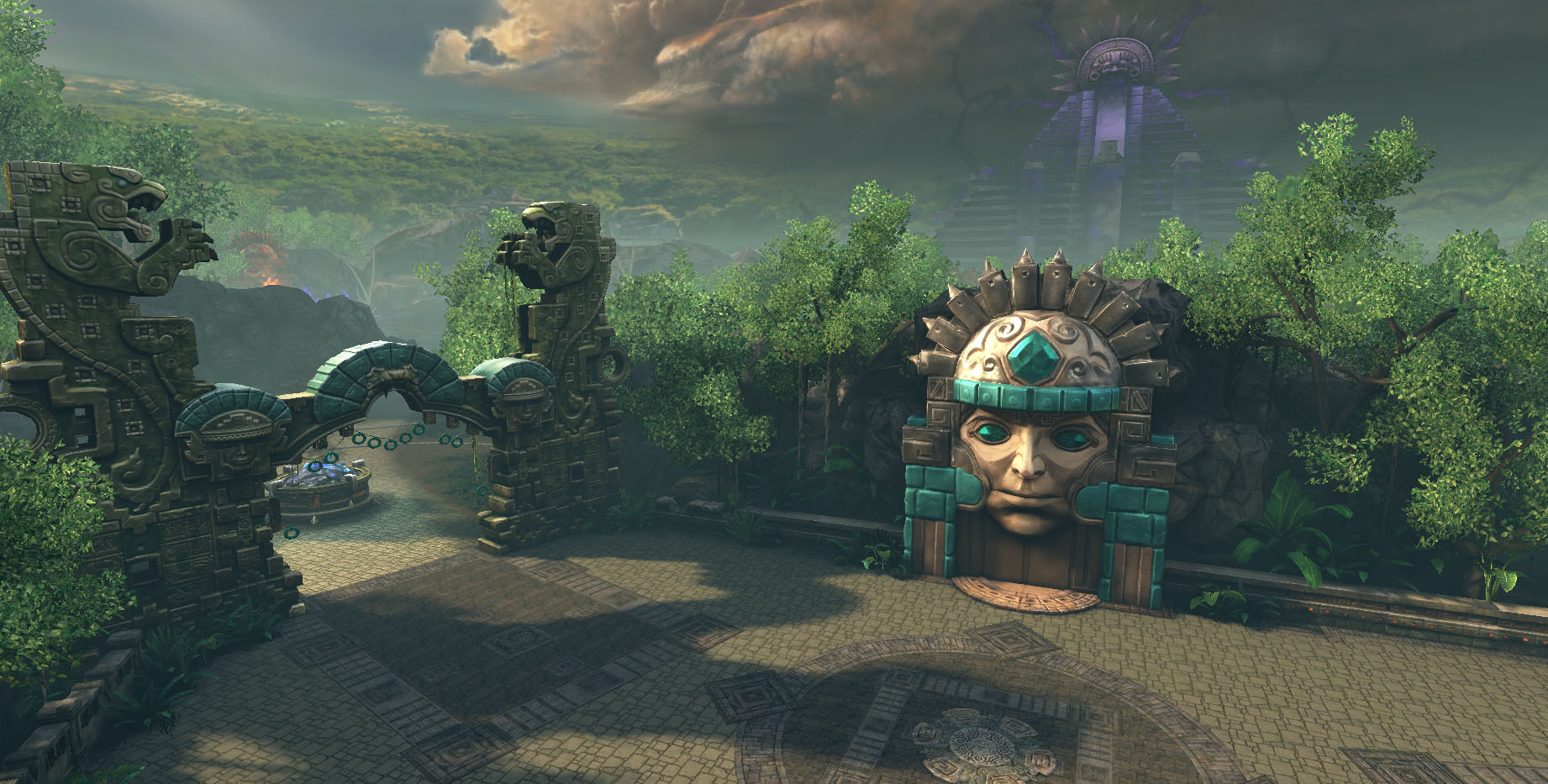
We also implemented teleportation portals in bases so that players could quickly return to the action without having to run to join team fights. These portals are only active when a friendly lane-pusher is up. The idea was to provide a way to help players escort their lane-pusher and end matches relatively quickly. The art team and I had come up with an idea to have an Olmec style head, with a mouth that would open and close based on whether the portal was active or not.
Eventually, the Silver Fury was replaced with the Juggernaut monster. The temp art for the lane-pusher was replaced with a “captured” version of the jungle Juggernaut.
Completing the Map
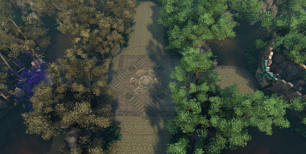
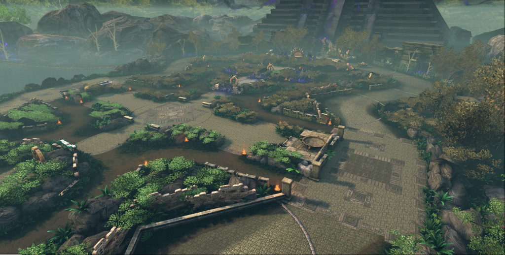
Throughout most of the process, I worked in tandem with the Lead Environment Artist, Sean, to set dress the map. Initially, this involved placing temp assets that would be representative of how the map would later look in its Order vs Chaos styling. Dead trees and foliage and emissive “corruption” were used to distinguish the Chaos side from the lush jungles of the order side. We worked together on making sure the player could figure out where s/he was located, and establishing a feel for the map art. I managed and organized the Kismet set up for the majority of the map, including the Olmec head functionality. Sean set up the Kismet for the lightning strikes on the Chaos side. Once the map was officially released and no further changes to layout were needed, a final art pass was done to bring the map to its current state, as pictured below.
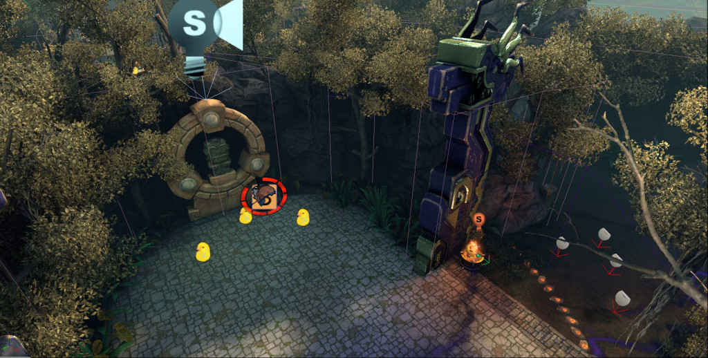
I was also responsible for the blocking volumes placed in the map. Most environment pieces in Smite don’t have collision associated with the asset; instead, map collisions are done with blocking volumes. Additionally, there are volumes around jungle camps to “leash” them, making them reset if a player disengages. Help volumes cue tips for players who have the new user experience guides turned on. Additional volumes for base spawns and item stores have to be placed and managed, which all fell into my realm of responsibility.
Finally, I did “Spectator View” pass on the map. This is what usually gets shown during tournaments, and is only seen when in spectator mode. It involves doing a lot of visual simplification of areas to show where players are in the world, without the excess geometry blocking view of where the players are in the world. This involves crushing trees down in a way to show that there are islands of collision and LOS blocking assets, without making those trees look awkward and silly. Many of the more architectural features are either removed entirely, or are replaced with halved versions to represent their placement in the player-view. In many ways, this is the most painful tedious part of the process, as it involves simplifying the map in favor of viewing clarity without destroying too much of its character.
Personal Contribution:
Level design and prototyping, Kismet scripting events, initial set dressing/lighting, work closely with design and programming team to create and refine a new game mode, work with the art team to develop visual style of the map, spectator view of the map, placement of volumes for collision and gameplay

You must be logged in to post a comment.