If you’re reading this and the post-date is not Thursday, August 15th… woohoo! I’ve figured out how to set updates to publish later! (I am currently on vacation until the 26th, so responses and commentary approval will be slow).
Warning: this is a long update, and not about a new CTF map. I may discuss why I wanted to do an arena map in a later post
The Iterative Map Process
All mapmakers design differently. There may be similarities in the steps of development- preplanning & references, whiteboard layouts, whitebox, etc- but the time spent and the areas focused on tend to vary from person to person.
My process for Tribes involves a lot of iterative map changes. A lot.
Part of it is because (right now) I have a lot of time to experiment. With the skiing mechanic, there are a lot of things that need to be done in order to make a map’s flow feel right. “Feel” is a purely subjective, but when players are consistently running into deadstops or corners, a map feels bad for everyone. Many times I’ll draw out a basic idea on my whiteboard, bulletpoint what my plans are for the map, and play around with concepts there. However, sometimes concepts don’t translate well into the actual Editor- scale is a big reason, available art assets, physics, mechanics… there are a number of reasons why a map might not play the way I have it imagined. Playtesting frequently helps me see what needs to be changed, and what’s working out. This turns into having several iterations and incarnations of a map before it goes live. Sometimes I will scrap a map completely in favor of focusing on design elements that HAD been working, and go from there.
When porting a legacy Tribes map, I have to decide how 1:1 to make it. Art is always going to be the most obvious change, but scale is a more subtle detail to consider. With camera FOV and physics, it’s tough to decide just how big or small to make the new map. The game is also in a point of development where I know I’m likely not going to get any new art assets; this can prevent a challenge in some ways, especially when something doesn’t align the way I want, but it also provides a lesson in creative problem solving. Don’t have the right piece? Throw stuff together, and wing it (this is usually called “kitbashing” in the industry). In most cases, I’ve tried to keep the layout similar enough to the legacy maps as with Walled-In and Aerorena. With this next map I’ve been working on though, I’ve decided to go a bit beyond the 1:1 port, and use it more as inspiration instead.
Arena Under the Hill
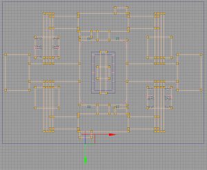
I’ve had several requests for this indoor legacy map since I started working on Tribes. It’s pretty symmetric across all axis, with a few slight additions or adjustments in some areas. I will make an effort to get screens from the original map when I return home

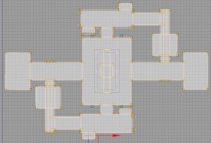
It’s hard to estimate the size from just a screenshot- this layout extends slightly larger than the OOB space for Walled-In. It’s a bit more confined, obviously, as it does not have Walled-In’s open spaces. Its hallways are slightly more claustrophobic than Undercroft, as there’s a central structure in the main room that takes up most of the middle space. Still, it’s a decently large arena, and the symmetry of the sides has led me consider to cutting part of it down to give the map a warped figure-8 layout:
Reasons for change:
– Yes, it does cut down on the playspace a bit, but that can be recouped by widening the central space and side rooms.
– Having fewer sideways will also direct gameplay back to the larger median area. This ties in to map flow, and a figure-8 pattern is seen frequently in game maps because of how well it works to aid it naturally.
– Having fewer sides lets me use better lighting and subtle set-dressing changes, to help players orient themselves within the map; for instance, having oneside be more orange from lighting, and the other blue. When wandering off into the hallways, you’d know where you were based on the lighting around you
Choosing the Art set:
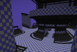
I went through a few iterations on the map whilst trying to decide which art set to use. The original map uses a StarWolf theme. I sadly have no art set for this Tribe. Generally in game development, it’s best-practice to whitebox a level (that is, doing a rough block out without textures or art) to adjust flow. With Tribes, I have the art sets available and some pieces help with ski-flow, so I use a mix between blockout shapes and the ski meshes.
I started out with the Children of the Phoenix set, as it has several good ramps to help curve the walls and ceilings. I also have a bias to the set- I love it. I think it’s cool. I like the CotP. And their logo is totally badass. But these are my personal opinions, and the Phoenix set has already been used for Undercroft and Inferno and the wip-TDM map Sepulcher. I knew I should probably use a different set.

My next experiement was to use the Diamond Sword set. I had some success with it, as the ice tunnels made for interesting art in the side hallways. However, because most of the set is crafted with varying shades of grey, it was hard to get good lighting and enough pallet variation to make the space be not-confusing. The rough ideas were cool, and I liked some of the stylistic features, but it wasn’t working well enough to continue fighting with it.
Next move?
Take a step back, see what art sets I have available, and what I haven’t played with much in the Arena files.
After doing a bit of digging, the current iteration I’m working on is using the Blood Eagle/Arx Novena set. With this set, I’m thinking to turn the space into an underground water facility/sewer like area. One side would have holes in the ceiling for natural light, whilst the other side would ideally have a darker and more murky feel to it. The central space will likely have a lot of pipes and whatnot for the art. Neutral inventory stations will be in the center of the map. Spawn areas would be in the side rooms, although I may bump up to 4 locations, instead of the 2 main spawn rooms used in the Legacy map.
Remember: this map is still a work in progress and in its very early stages. I may decide to scrap this art set and try a different one again, and there may be more modifications to the layout. Because of how the layout has changed, I’m not sure if I should call it “Arena Under the Hill”, or name it “Arena Under SomethingElse” (note- not actual name in consideration) in homage. I’ll probably made some decisions and changes based on feedback from Reddit and here. I’ll respond to Reddit questions when I can =)


You must be logged in to post a comment.