This post was pretty spread-out, so I apologize in advance for ramblings.
There was a comment on the old HiRez forums from a player that I loved so much, I made it my signature for years. While I don’t remember it exactly any more, it was something along the lines of:
“The map is too big/small, the hills are too high/not high enough, too much green, too much bloom. You ruined it HiRez!”
I loved it because it was a snarky summation of many comments in our Map Feedback threads. This was especially true for CTF maps, where one could read criticism on how large a map felt, and then find a complaint not three posts later lamenting that the map wasn’t larger. From reading hundreds of comments and discussions, I settled on the idea that much of the debate stemmed from nostalgia clashing with physics changes. Many older Tribes maps may have been bigger than what they are in Ascend, but they were built for a different engine and different physics. Prior to HiRez allowing physics tweaks on rented servers, maps were designed explicitly for how the base version of Ascend worked.
Map Sizes & Perception
There are three map size classifications for T:A maps- small, medium, and large. Pretty standard fare for most any game. Deciding on how large to scale a map though is its own design beast, and can frequently be the make-or-break on how well a level is received. Several things influence how “big” a map may feel, based on its technical and perceived size.
One technical factor is the measurement of distance from flag-to-flag, but this number is pretty bland and misleading. Some maps are fairly open, and you could draw a straight line from flag stands without running into much midfield obstruction; Crossfire is a prime example of this. You can literally fly through map from one base to the other without even touching the ground. There are no large hills to block line of sight, there are no huge trees or towers. It’s a very straight-forward design. Other maps like Temple Ruins, Arx Novena, or Drydock have elements blocking those direct routes. Forcing players to circumnavigate large hills or assets adds an artificial “extra” distance to the flat flag-to-flag measurement. I could still use flag to flag measurements to compare map size, but depending on the terrain/asset placement that number could be misleading.
A second is the overall size of the playing field, measuring the area within the bounds of the Creativity wall. These are some of the technical details that contribute to scale. The distance between a base and the Creativity Wall influences how players set up their flag-grab routes. For instance, a smaller space provides less room to set up high-speed back-to-front routes. Such routes are frustrating for defenders, as it means chasing someone who already built up a lot of speed, and may already be half-way across the map. Additional space also makes it harder to spot incoming enemies, and prepare ways to block them. Bringing the Creativity Wall usually cuts off some angles for these routes (although there are exceptions, such as high-hills around a base, or meshes that allow for rock-bouncing).
Terrain elevation and base-design work in tandem with the other design features to offer more distortion in a map’s size. For example: the flag distances on Arx Novena and Dangerous Crossing are fairly close; there’s only a difference of ~500 Unreal Units, with Arx having the wider span between flags. However, Arx features flag stands that face each other, allowing players to race in directly over terrain that (comparably) doesn’t have very dramatic changes in elevation. DX has the shorter flag stand distance, but a larger over-all playing field, higher hills, deeper valleys, vision-restricting fog, and bases that force players to come in from the sides to grab the flag.
So which map is bigger then? Which map feels larger?
For reference, here are some of the other map sizes (approximate):
- Arx Novena- 82,00o x 65,500 uu playfield; 35,500 uu direct line between flagstands
- Dry Dock- 65,500 x 65,500 uu playfield; 35,000 uu direct between flagstands
- Katabatic- 90,000 x 73,700 uu playfield; 46,000 uu direct between flagstands
- Canyon Crusade Revival- 115,000 x 78,000 uu playfield; 46,000 uu direct between flagstands
- Blueshift- 131,000 uu diameter playfield; 53,200 uu direct between flagstands
- ———————— Extras—————————–
- (unreleased) Terminus Station- 66,000 x 79,000 uu playfield; 47,000 between flagstands
- TDM maps average about 45,000 x 45,000 uu playfield
- Air Arena is the smallest arena playsfield, at 8,000 x 8,000 uu
- Walled-In – 14,300 x 12,300 uu playfield
- Epic’s CTF map Necropolis’s playfield measures at 26,600 x 8,000 uu playfield; 16,400 between flagstands
Tessellations
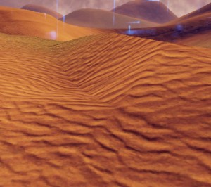
There’s no exciting trick regarding our setup of the terrain. For the majority of the maps, they are 512×512 patches with a max tessellation level of 8.
Tessellation level refers to how small the terrain patches gets broken down into, which helps to terrain. Note, the smaller tessellation level, the more rendering cost. CCR has the lowest tessellation of 4 (Unreal default; all levels must be powers of two). However, most players won’t notice the max level whilst playing. You’ll generally only notice the lower levels further when looking at hills further away. They’re the ones that look “sharper” because of the lower detail, but this helps the game run better as it’s decreasing the number of tiles to render.
Legacy Heightmaps
When creating ports of the older maps, we ran into several issues trying to use heighmaps.
First, we learned that our players really love mirrored maps. We have the asymmetrical Katabatic, but for the most part our maps are either rotational symmetry, or mirrored across one axis. This ensures that competitive players can have a tournament match, and not feel the need to switch sides to make sure both teams have equal opportunity to win.
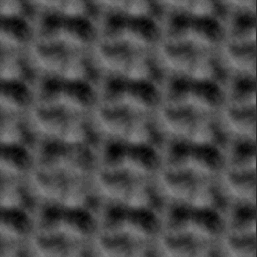
Many of the heightmaps from legacy Tribes levels weren’t strictly “mirrored” maps, but instead were terrains that used repeated patterns. Here’s a look at Stonehenge-
It doesn’t lend itself it being mirrored nicely without some work. Also keep in mind that when importing height maps into Unreal, they don’t tile. The map gets stretched to cover the size of the terrain.
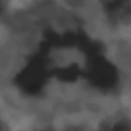
Now, let’s look at the heightmap I started with from Canyon Crusade:
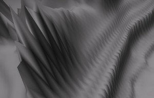
It’s closer, but not 100% mirrored to begin with, so I knew I was going to have to do some editing. I did take it into an image program, and mirror a side to make it a little bit more balanced. However, because of the pixellation of the bitmap files that get imported, we’d wind up with terrain looking something like this:

Even when I’d manage to get a terrain to be mirrored, there can be glitches with the smooth tool if something is even fractionally off. For instance, the “spikes” in terrain, which were the bane of my existence in CCR

What we wound up doing for most maps then was using the terrain paint tool to get the basic shape down, and make adjustments from there. It might not make maps 1:1, but it would at least be more balanced.
Trial & Error
What everything really boiled down to was figuring out what worked with our physics, and what combination of elements made a map feel good. Most maps went through several iterations in its terrain- during in house tests, PTS tests, and live server feedback. We also learned not to make too many changes too quickly, otherwise players would get too frustrated; they needed time to adjust to a map’s new layout, find the routes, and then decide what needed to change after a few weeks. Further iterations needed to be done to make adjustments based on physics, bugs, and gameplay until a map feels good. (and yes, I’m aware that it’s all subjective)


You must be logged in to post a comment.